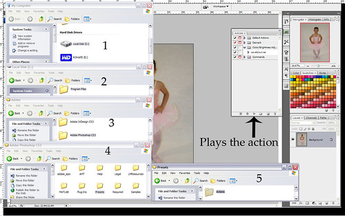
Add the action set to your Actions folder under your Photoshop folder.
To use the action just press the triangle "play" button.
Saturday, May 9, 2009
Adding and using Action sets
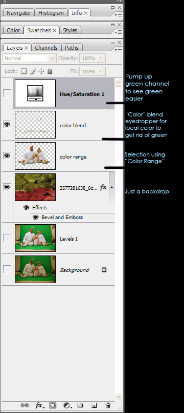
Removing solid background/ green screen
Hope this helps. I guess this could be considered my first tutorial.
The saturation was just used to bring the green out more to brush over.
"Brush" in the local color on the "Color Blend" layer to cover the green cast.
I also made a "Curve" and "Levels" adjustment. Not shown in picture.
Let me know if you have any questions. :)
Using Textures tutorial
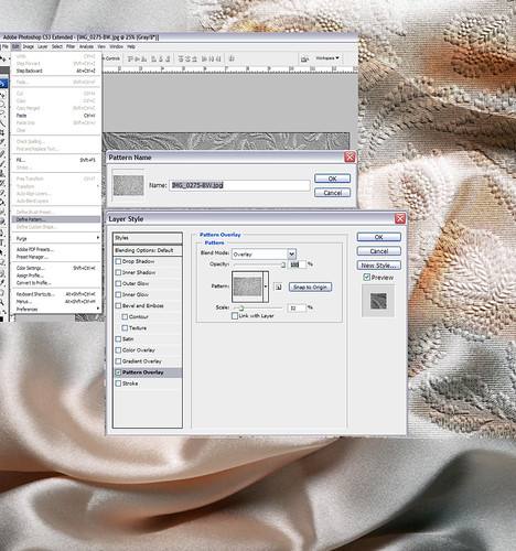
B&W images usually work best as a texture, depending on the look your going for. Open your desired texture image.
Edit>Define Pattern
Name your Pattern>click "OK"
To use your new pattern. Open your target image. I used this image of satin sheets (which work well as a texture to give solid images a "wavy" appearance).
Add a "Pattern Overlay" layer style. It's the "fx" button at the bottom of your layers tab. Or right click on the desired layer and select "Blending Options".
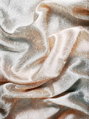
I used the "Overlay" layer mode, but you can use other's depending on the effect your looking for. Make necessary adjustments to get the right look. Here is my completed image for this tut.
www.flickr.com/photos/rohape/3199234097/sizes/m/
Now you may be asking why I have a piece of the texture overlayed on this tutorial. This is to demonstrate why Defining Pattern is preferable. Defining a pattern allows you to "wrap/repeat" the image and resize for detail and fit. It's much more difficult involving other layers, moving, resizing, but why go through all the hassle?
If I missed anything or you don't understand something please let me know. :)
Edit>Define Pattern
Name your Pattern>click "OK"
To use your new pattern. Open your target image. I used this image of satin sheets (which work well as a texture to give solid images a "wavy" appearance).
Add a "Pattern Overlay" layer style. It's the "fx" button at the bottom of your layers tab. Or right click on the desired layer and select "Blending Options".
I used the "Overlay" layer mode, but you can use other's depending on the effect your looking for. Make necessary adjustments to get the right look. Here is my completed image for this tut.
www.flickr.com/photos/rohape/3199234097/sizes/m/
Now you may be asking why I have a piece of the texture overlayed on this tutorial. This is to demonstrate why Defining Pattern is preferable. Defining a pattern allows you to "wrap/repeat" the image and resize for detail and fit. It's much more difficult involving other layers, moving, resizing, but why go through all the hassle?
If I missed anything or you don't understand something please let me know. :)
Finished texture
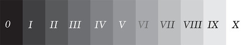
The Zone System
This information is taken from "Exposure and Lighting for Digital Photographers Only" written by Michael Meadhra and Charlotte K. Lowrie
The Zone System was made famous by Ansel Adams and originally designed for B&W photography. It's an excellent tool to help photographers develop a better understanding of the interrelationship of exposure and tonal range, which in turn makes it easier to predictably produce properly exposed images.
The zones progress from absolute black to pure white, with each zone being twice as bright as the next darker step. Thus the zones are arranged in increments that correspond to one stop of exposure (one EV)
Zone 0: Pure black, no tone or texture whatsoever, absolute darkness, or its photographic equivalent.
Zone I: Near black, barely discernable tone, no texture - deepest shadows and silhouettes - dark end of the dynamic range.
Zone II: Textured black, very dark but showing a hint of textural detail - deep shadows on dark hair or cloth - dark end of texture range.
Zone III: Dark gray, shows distinct tone and textural detail - detailed shadows such as the dark bark on the shaded side of a tree
Zone IV: Medium-dark gray, an open dark gray with excellent textural detail - open shadows such as the shadowed side of a sunlt building or a strongly lit portrait, dark green foliage
Zone V: Middle gray, the tone of a standard 18% gray card - a luminous shadow such as the shadowed side of a low-contrast portrait, weathered wood, or dark stone - the standard target value for light meters
Zone VI: Medium-light gray, a bright midtone showing sharp detail - average Caucasian skin in good lighting, a concrete or stone building
Zone VII: Lightest gray, the brightest tone that still shows good textural detail - gray hair, light colored cloth
Zone VIII: Textured white, very light but showing a hint of textural detail - highlights on light skin, textured snow or white sand - light end of the texture range
Zone IX: Near white, barely discernable tone, no texture - highlights on white or light colored objects such as an egg shell or teacup - light end of the dynamic range
Zone X: Pure white, no tone or texture - specular highlights and light sources
This book is amazing. I can't compare it to any other exposure specific books. I just feel that this book explains the elements of lighting and leaves it to you to take what you read and use the information to learn to take better pictures. It doesn't tell you how to take the picture, it helps you understand what your doing and why things work.
There is more to using The Zone System, but it's way too much to write and there are pictures to help you understand how to use it.
Photography Abbreviations
Talked to someone today and abbreviations was brought up. I thought this might be a valuable thread/sticky.
I'll start it off with some I can think of off the top of my head and can add some more later tonight.
As more are added I'll update this first post so no one has to search so much. As it gets longer I'll alphabetize it. These will not contain definition's, search on the site for more info or google. If you feel it's post worthy, post it. What better way to learn yourself than posting your understanding.
PP - Post Processing (photoshop)
PS - PhotoShop
DOF - Depth of Field
ISO - International Standards Organization
PSP - PaintShop Pro
EXIF - EXchangeable Image file Format
EV - Exposure Value
HDR - High Dynamic Range
IS - Image Stabilization
WB - White Balance
DNG - Adobe Digital NeGative
ACR - Adobe Camera RAW
Wow, a lot shorter than I thought it would be.
More to come.
Thursday, May 7, 2009
ISO, Aperture, Shutter Speed
This is always a big topic of discussion. While I am no professional, I feel a have a pretty good grasp on this. Anyone feel free to add on or challenge. 
ISO Adjusts your sensor's sensitivity to light. Lower it for more detail and when you have plenty of light. Raise it as your light source gets dimmer.
Shutter Speed How long your shutter is open allowing your sensor to be exposed to more or less light.
I know a lot or all of anyone reading this has read a book or about this somewhere else. The best thing I can suggest is, instead of going around shooting, pick a time of day. Choose 1 subject, flip over to M, look at your settings, take a picture. Make adjustments to ISO only, take a picture. What happened?
Ok, leave your ISO alone (bright day light flip it back to 100 or your lowest setting). Go to your f/stop. Lower it all the way (2.8 etc.). Your lowest f/stop is considered "wide open".
Seeing a trend here? Change one setting at a time, at the same shooting location at the same time. Look at what's happening to your shots. Practice, practice, practice. Make a conscious effort to focus what you've read in your books in to practice.
I really don't know how to explain how it "clicked" for me. Practice and paying attention to what was happening. I did just what I said earlier. I sat down and took about 50 shots of just one thing making changes one at a time. Went to the computer looked at the EXIF data. Read a lot, learned how to read a histogram, how to read the exposure reading on the camera. The +_|_|_0_|_|_- readout.
I hope this didn't make things more confusing for anyone and helped someone.
UPDATE: Meet Aperture. To get this thread flowing let's discuss what else we see different (not just the picture but description) besides the shutter.
F/5 ISO 100 1/200
F/10 ISO 100 1/200
F/25 ISO 200 1/400
Editing RAW files
This may need to be under tutorials? Any way here we go. I don't want to go too fast or too slow so I'm going to just give some tips to start with. This is based off ACR (Adobe Camera RAW) version 4.1. If you have a different editing program bring it up, we'll work through it.
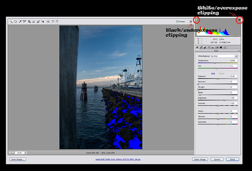
Basic steps for correcting an image in order from beginning to end on the first tab in ACR. Has the little aperture looking icon.
Histogram - There it is and there are two triangles to show shadow and highlight clipping. (There are hundreds of books for exposure and histograms)
WB - Correct color cast for incorrect White Balance. If you choose Custom the Temperature and Tint sliders are there for making your own corrections, creative or accurate.
Exposure - Use this mainly to expose your shadows. At this point if you have your "triangles" off you can hold down the 'alt' key to show clipping while you adjust this slider. The positive and negative numbers for exposure work the same as exposure on your camera. +2 = 2 stops -1 = 1 stop etc.
Recovery - This slider is mainly used to knock down your highlights. You'll see it if you have your highlight triangle on and there is highlight clipping. Don't get too crazy with this slider. It can turn your whites a little flat and grey.
Fill Light - Use this to bring out those hard shadows. Can also make the image appear flat.
Blacks - Makes shadows and blacks darker or lighter. You can use the 'alt' key to show clipping as well if 'triangles' are off. Use this before "Fill Light".
Brightness - Used to adjust Mid-tones.
Contrast - Defines light and dark areas of image, usually used to add depth to an image. As you increase contrast it will darken the image, but decreasing will give the image a flat look. Use as desired.
Clarity - Kind of like a mid-tone contrast/ sharpening tool.
Vibrance - A safe way to boost color in your image without blowing colors out of gamut.
Saturation - ....saturation
For those that don't have ACR and want to follow along or if your having issues opening or whatever the case is. The image is clickable to lead to a larger image.
First blog...ever
This is my first time ever "blogging". I'm using this space to hold all the Photoshop Tutorial's I've created. What I'm doing, where I've been. All photography & post processing related.
-More to come, stay tuned-
Subscribe to:
Posts (Atom)